 Adding buttons to your website can be a great way to get visitors to take action.
But if you are not a coder or developer, is this then even possible?
The good news are that it definitely is possible no matter your technical skills.
In this article you will learn how to create buttons for your website, what you need to consider when making them, and you will find two different options to do this, so you can choose the method that suits your needs the best.
The importance of adding buttons to your website
More or less any website has a goal. Often it is to give information to visitors and then getting the visitors to take action. This can for example be to read another article, to contact you, to buy something, to follow you on social media, sign up for your newsletter, etc.
There are many ways to do CTA (call to action), where you encourage visitors to take action. It can just be links or text, but a very used method is to use buttons.
You will see buttons on almost any big company’s website – the reason for this is that they stand out, and it makes it easy for visitors to see what action they can take on the site.
Website visitors are very impatient today, so you need to make it easy for them to find the info they are looking for, and make it easy for them to get to the next step. A part of this is of course to create awesome and easy-to-read content for your website, but buttons are amazing at making it easy to quickly see what to do next, and there is a greater chance your visitors will not just leave without taking action.
With that said, be aware that you do not have to use buttons for all CTAs on your website. It can easily become too much and too forced. So keep it natural and add them where it is appropriate and helpful for the visitors to get the best results – if not, your visitors might instead feel like you are spamming and pushing them and will quickly leave.
So buttons are amazing to use and can add great value to your website, but use them wisely and in a balanced way in combination with text links and great content.
Is it possible to create buttons for free?
 Before getting to a couple of ways you can create the buttons, let’s first discuss the free vs paid option.
There are free ways to make buttons for your website, and I will show you this below. As with more or less any tool you use to enhance your online business, the free options have some limitations.
These limitations can be fine and can often still take you far. It all depends on your needs. Personally, I used the free method I will show you below for quite a while, until I got tired of it and wanted more options. At that time I has also started making money on my websites, so I had the budget to invest to get better options.
The reasons I am mentioning this is so you can consider your needs. If you do not have any budget at all, but want to start adding buttons to get better results on your website, then go for the free option. It can be great and get good results, and you can always then go for paid options, once you have started earning money on your website. Or maybe you will just keep using the free option forever, if it does the job for you.
If you have a bit of budget and want to invest it into improving the user-experience on your website, maybe going for a paid tool to create buttons is this way to go.
Below, I will show you both a free and a paid tool you can use to create buttons, and then you can see which one fits your needs and preferences the best.
Ways to make buttons
As mentioned above, I will show you both a free and a paid way to create buttons for websites without doing any coding. The paid obviously has some advantages, but the free tool is also a great option depending on your needs. So let me show you the two tools, so you can decide which option is the best for you.
Option 1 – Use your theme settings (WordPress option)
Personally, I use WordPress to make my websites, and find it a great way to create websites. If you have a WordPress website, one way to create buttons is to use the options your theme has.
As you probably already know, there are thousands of WordPress themes – some of them paid and some of them free. All of them have different options as a part of them.
Some themes have the option to create buttons. Actually a few free themes even have this option, so if you have a free theme, where this is an option, you can just start using these.
The advantage of using buttons in your WordPress theme is that the buttons will look professional and be interactive with a hover effect (depending on your theme).
To get the most options for creating the buttons you want, it might however be worth investing in a paid theme. The buttons are not the only reasons for this, but paid themes in general have more options, better support, more updates, and a lot more advantages. The theme I am using for this website is the Divi Theme, which is one of the most flexible themes, and it has great button options, so you can create them exactly the way you want them to look like (see example of a button below).
Above you can see a button created here on this website that works with hover effect and link. It is just a standard button, but you can be as creative as you want to with buttons, and there are a ton of possibilities. To get an idea and inspiration, you can see a few examples of other ways you can create buttons with the Divi button module below.
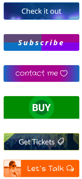
A few examples of creative buttons with the Divi Theme.
Divi is however not the only WordPress theme with great button options. Most of the big and modern themes has good options in the area.
So if you are using WordPress, it is definitely worth looking into the options of your theme, or looking into getting a theme with more options, as this can be a great and easy way to create engaging and good-looking buttons and at the same time in general get more features for your website.
Option 2 – Create buttons as images
If your theme does not have the option to create buttons, and you do not want to get a new theme, or if you are not using WordPress, there is a great online button maker you can use for free.
It is called Da Button Factory, and you can use it to create button images that look nice and works well as CTAs. You can see a examples of the design that is possible with this tool below.
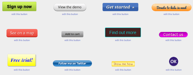
Da Button Factory is a way to create buttons as images for free.
You can change colors, texts, shadows, fonts, shape, size and more. You can then download these image and upload them to your website. There are several other similar tools like this that also work nicely. This is just the tool I have found to be very easy to use with many different options.
It does not give quite the same effect, as the buttons you can create with WordPress themes, as the images are static and there are no hover effect. But it can still work very well, and be a great option, if you do not have the budget to get a theme with these options and do not want to code but just want to keep it simple and effective.
If you use this option, then remember to optimize the images for web, before you upload them.
The design of buttons
There are many discussions about what the best design of buttons and CTAs are in general. I have looked into different research and discussions, and there are many opinions. Some research for example show that red is the best color to get people to take action, whereas other research has shown that red is a warning color that people think is a sign of danger and therefore do not click.
So it seems there is no exact definitive way a button has to look like to work. It depends a lot on the rest of your website’s design and your preferences. What is important is that it fits into your overall design and is complimentary to it, but at the same time stands out, so it is easy for visitors to see it and know what to do next.
No matter what, a great way to find out what works best for your particular website is to test it. That means to test different kinds of buttons and see what results they give. It can for example be done by using a website analytic tool like Google Analytics, where you for example can measure, if people go to the next page, when they are on a page, where you have a button.
There are also tools specifically just for split testing buttons. This is one of the reasons I love the Divi theme, I mentioned above, as it gives you the option to split test buttons. This means you can create different versions of a button, and different buttons will then be displayed for different visitors.
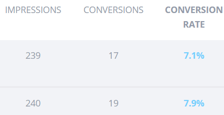
Split testing your buttons is the best way to find the design that gives the best results on your site.
After a while you will have some great and precise data about which button performs the best, and this kind of split testing is the most effective way to find out for sure what works best for your website. So if you have access to a split testing tool, you should definitely use this. Or if you at some point want to be more serious about split testing to improve results on your website, you should consider getting a tool for split testing.
Final thoughts
Having buttons for your website is a great way to get your visitors take action, stay on your site longer, and also make you more profit.
There are both free and paid ways you can create these buttons without having to do any coding, so it is something you can use on your website no matter your technical skills and budget. And remember it is a good idea to test to find out which kinds of buttons work the best on your site.
So now it is up to you to start using the tool and method above that fits your needs the best. If you have any comments, questions, or need any help, just leave a comment below, and I will get back to you asap.

